The logos (1 and 2) captured the business's interest, prompting them to visualize the logo animations of both designs to decide which one would best represent their business. Both logos depict the connection between green energy and everyday life, incorporating elements such as homes, landscapes, solar panels, and appliances. The design and color scheme of each effectively communicate the business's core values and purpose, while also symbolizing how an energy-efficient environment represents sustainable energy sources.
Greenthermique
TOOLS USED
- Adobe Illustrator
- Adobe After Effects
Overview
For this project, I had to create a logo for an emerging entrepreneur within the renewable energy sector. Our main objective was to promote sustainability and environmental consciousness in a world powered by diverse natural resources.
I designed a moodboard that captured the essence of growth, sustainability, and professionalism using a colour palette made of green, yellow and blue. Green representing eco-friendliness and growth, while blue focuses on stability and trustworthiness. For typography, I opted for a Cherif Variable Regular font for its modern elegance and readability across platforms. I have selected images of nature, green energy to reflect Green Thermique's values and vision.
Ideation Process
Logo concept
The logo designs had to illustrate the connection between green energy and everyday life, incorporating elements such as homes, landscapes, solar panels, and appliances. The design and colour scheme of each elements effectively communicated the business's core values and purpose.
Logo style frame
When presenting these options to the owner of Green Thermique, it became evident that logo variation 1 stood out as the most fitting choice.
Logo variation 1
Click for more details
Logo variation 2
Click for more details
Green Thermique decision to choose the gradient logo over the solid version was driven by their desire to create a brand identity that not only reflects their values and aspirations but also resonates deeply with their audience. With its modern look, depth, and visual interest, the gradient logo embodies the spirit of innovation and sustainability that defines Green Thermique. Ultimately, the business opted for the Logo1 (Gradient logo) design and animation as it best aligns with their brand identity.
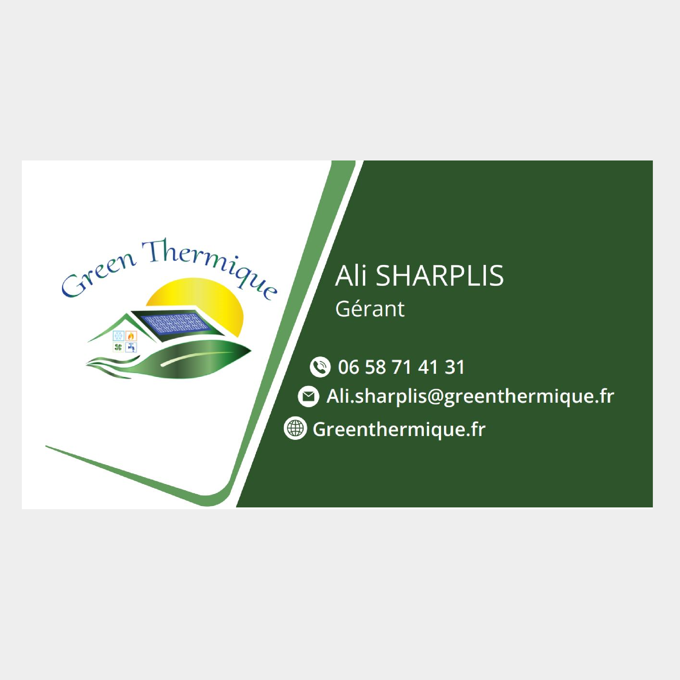
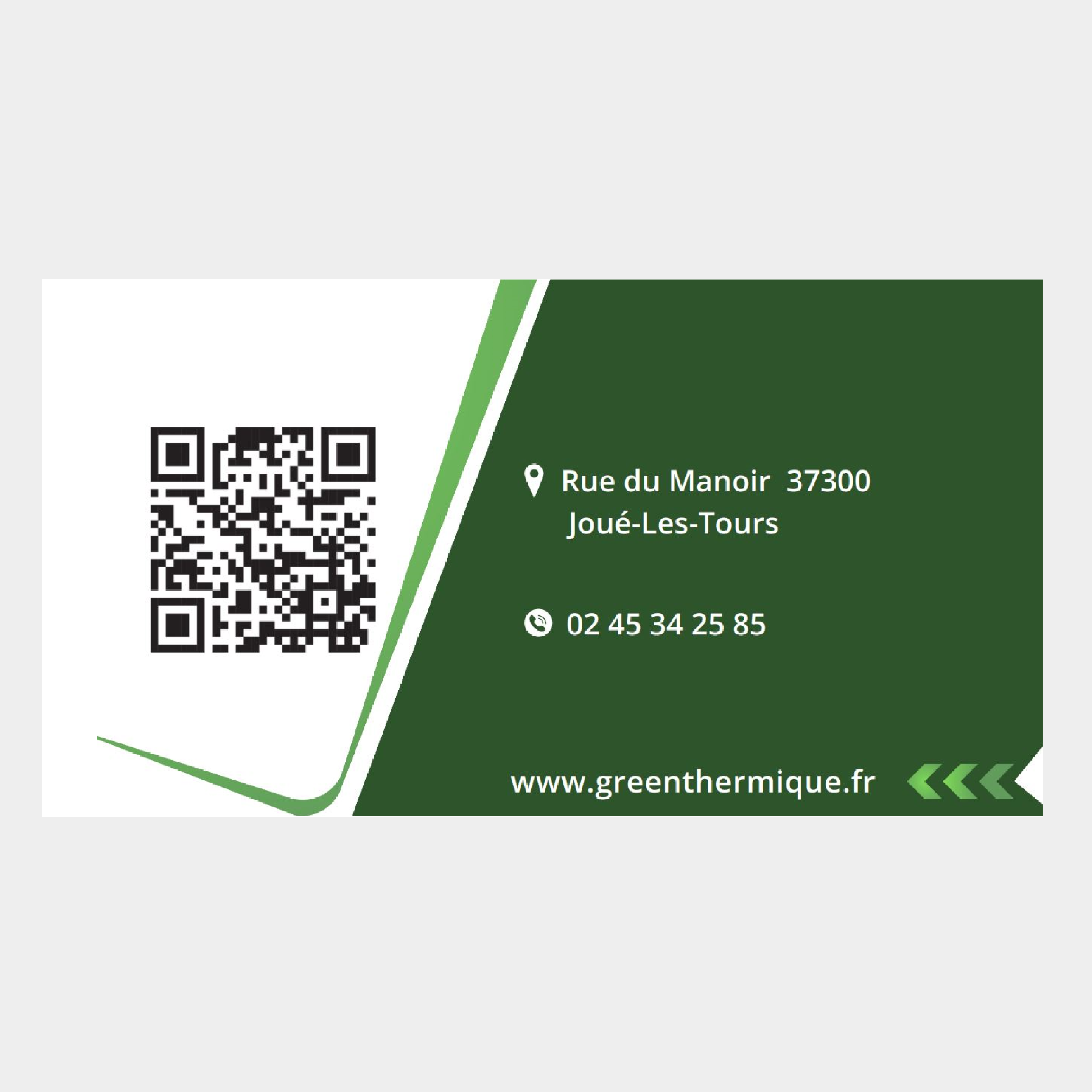
Branding materials
When presenting these options to the owner of Green Thermique, it became evident that logo variation 1 stood out as the most fitting choice.
Green Thermique decision to choose the gradient logo over the solid version was driven by their desire to create a brand identity that not only reflects their values and aspirations but also resonates deeply with their audience. With its modern look, depth, and visual interest, the gradient logo embodies the spirit of innovation and sustainability that defines Green Thermique. Ultimately, the business opted for the Logo1 (Gradient logo) design and animation as it best aligns with their brand identity.
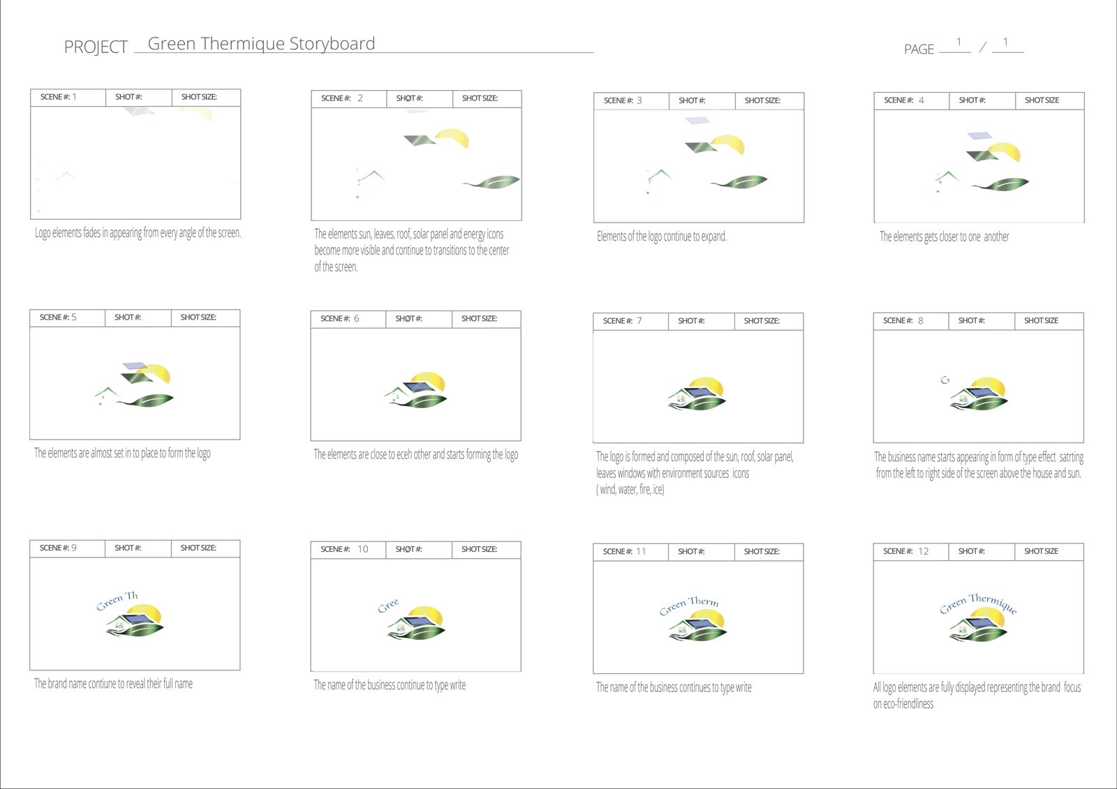
Storyboard
Exploration
Reflection
Overall, this project was successful and conveyed the essence of the brand. The owner was happy with the outcome of my work for his business.